Logo submissions, which have mostly been culled from these mailing list threads: one, two three and four
James Adam
-
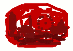 The original logo, done as a joke, but it’s the closest to an official logo as it was used at the
LRUG pub quiz
and on the flyer for the LRUG RailsConf London party.
Most other logos have used the basic idea as inspiration (e.g. a London skyline inside a Ruby gem).
 -
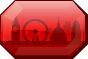 Actually a tweak of one of Paul Battley’s logos shown below. Also blessed with a modicum of official-ness as it’s
currently in use on the LRUG WWR page.
Paul Battley
 Also available in SVG
 Also available in SVG
 and
and  Also available in SVG
Richard Livsey
 Richard attempted to redesign the LRUG site and this logo was his attempt to bring LRUG closer to the then current Ruby logo.
This logo is another with a smell of official-ness wafting around it as it’s currently in use as the Logo on the
LRUG Last.fm group.
Skills Matter
 Skills Matter are our hosts for our meetings and they offered
us this logo and this has sparked the debate once again.
Murray Steele
 We have a spin-off meeting, which has it’s own logo. Can the main group logo reflect this
logo somehow, so that in some sort of bizarre reversal of the natural order of things the spin-off
influences the mainstream? (Also available in SVG).
Andrew Stewart
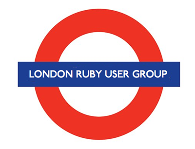 Of course, London has more icons than just a skyline. It’s likely however TfL would destroy us in a
legal sense if we used this. However, can the basic idea of the TfL roundel be used to make something
less obviously derivative?
Mike Thomas
 and
and  With or without ruby gems from Mike.
Matt Preston
 and
and  Two variations on a theme from Matt.
Chris Parsons
 Jason Lee also submitted a similar idea, but he didn’t collect it into a single image for hosting. So I’m crediting Chris.
Andrew McDonough
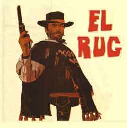 This is probably what normal people think when they hear LRUG pronounced. James Adam
has altered this to create his own version, which you can see here, but we’re giving
the credit to Andrew McDonough for doing all the heavy lifting.
Murray Steele (take 2)
 Based on thinking about what other icons London has (after Andrew Stewart’s TfL inspired version), we have the Thames
river. The execution is poor, but there might be some merit to the idea in the hands of a more skilled artiste.
Also available as svg.
Paul Battley (again)
 A slightly more aggressive logo this time round, from one man logo machine, Paul Battley.
Michael Burnham
 and
and  Nicely inspired by London, although why it’s EC1 is
 baffling to mequite clear to me now: our usual venue is in EC1.
Jonathan Lim
 A vertical choice from Jon.
